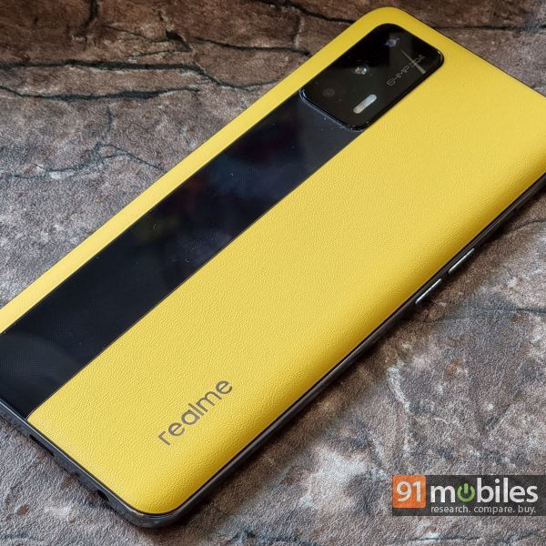
Realme has just revealed a new beta for its upcoming Realme UI 3.0, based on Android 12. The brand has been fine-tuning its interface in several aspects ever since it stopped relying on OPPO’s ColorOS skin. The Realme UI that I’ve used on so many of the brand’s smartphones over the past year has been fluid, clean, and user-friendly. With Realme UI 3.0, the company is looking to retain these aspects, and bring in more customisability and improve privacy. I got my hand on the early beta for Realme UI 3.0 which has been released for the Realme GT (review). Here’s a detailed look at what’s new.

Design elements and icons
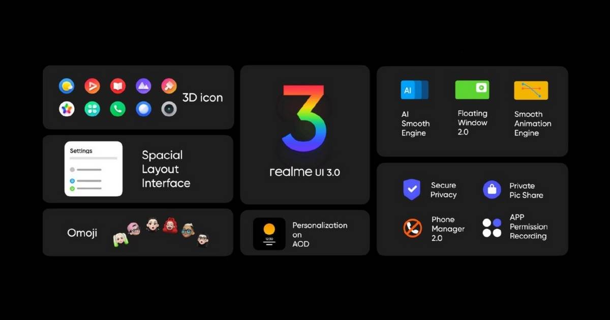
The update to Android 12 incorporates some of the new design elements that Google had revealed back in May. Icons have been fine-tuned to give them depth and a 3D look which Realme believes should appeal to the company’s youthful target audience. Personally, the difference is not striking but I do appreciate the nuanced look. Other changes include more spaced out options in the settings menu while the important titles and symbols are bigger and prominently displayed for ease of use. Compared to Realme UI 2.0, this looks to be a more noticeable change for me.

Always-on display and themes
In earlier versions, the customisability options for the always-on display (AOD) were limited to a small number. However, with Realme UI 3.0 you can now get a variety of themes to set on the display including Realme’s mascot realmeow. On the Realme GT, I am able to also draw a pattern using different brush styles, shapes, colours, and more. There is also the option to use an outline of my own photo as the AOD which is quite interesting to see. Moreover, I can save all these AOD themes to use at my own convenience. Realme has also given the option to customise the theme colours to your liking. Not just that, you can even get the icons, backgrounds, and fonts to match the colours on your wallpaper.

Floating windows and interface changes
The concept of an app opening in a split-screen or a floating window is not new to Android. Even so, on Realme UI 3.0, I can make this floating window appear easily and resize it to conveniently work alongside other apps. For instance, on the Realme GT, I can swipe on the side to bring in the Smart Sidebar which houses a few apps that I need on a regular basis. Just dragging and dropping the app on my main window will make it a floating window which I can then resize, open in split view, drag and drop files and more.

The Simple mode enables all icons and texts to become much bigger for easier navigation. Also now you can customise the in-display fingerprint icon on the lock screen to open some pre-determined apps just by swiping.

AI Smooth Engine, privacy and general usage
Now Realme also touts improved memory usage by about 30 percent, increased app loading speeds by 13 percent and battery life improvements in the range of 12 percent with the newly-introduced AI Smooth Engine. Obviously, these are claims that are hard to test in metrics and the Realme GT itself is a very performance-centric device that already makes the entire software experience much more fluid.

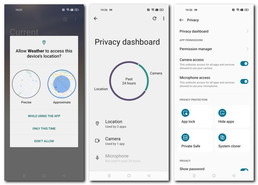
As far as privacy features are concerned, Realme has introduced the ability to delete image metadata such as timestamp, camera model and location before sharing photos. App permissions also get a more pictorial representation to easily highlight the app’s demands from the phone.

The general usage across the UI seems very colourful, fast, and easy on the eye. As I had mentioned before, the Realme GT already does a wonderful job at fully utilising the UI and all its performance aspects. Things like the drop-down quick settings menu, arrangement of icons, app drawer, settings menu and more have remained the same from the last iteration of Realme UI. The company has provided a roadmap of devices that would get the Realme UI 3.0 and you can check the list via the link below. I think it would be interesting to see how well the interface runs on Realme’s more popular budget smartphones.
Related read: Realme UI 3.0 rollout schedule
The post Realme UI 3.0: what’s new first appeared on 91mobiles.com.
via ©91 Mobiles


ليست هناك تعليقات:
إرسال تعليق